Bank Efficiency Ratio: Reading Cost Discipline
How the FDIC efficiency ratio is defined, the below-60% screening threshold, and the FY2025 comp ladder from JPMorgan 52% to Wells Fargo 66%.
Educational analysis for professional use. This guide is not investment advice or a recommendation to buy or sell any security, and it is not personalised.
Lower Efficiency Ratio Means More Revenue Reaches the Bottom Line
The efficiency ratio measures how much of a bank’s revenue is consumed by noninterest expense. It is the sector’s standard cost-discipline lens: noninterest expense ÷ (net interest income + noninterest income), with intangible amortisation excluded from expense under the FDIC/FFIEC definition.
A 52% ratio means 52 cents of overhead per dollar of revenue; 48 cents is left before credit costs, taxes, and capital charges. There is no regulatory maximum, but the spread across large banks is wide enough to drive return differences.
Definition and Label Variants
| Element | Treatment |
|---|---|
| Numerator | Noninterest expense, less amortisation of intangibles |
| Denominator | Net interest income + noninterest income (total revenue) |
| Direction | Lower is better |
| JPMorgan label | Overhead ratio (same concept, different name) |
Fed Governor Olson’s 2003 community-bank speech noted the best one-third of community banks operated well below 60%. That reference anchors our screening threshold; it is not a statutory standard.
FY2025 Comp Ladder
Filed FY2025 efficiency ratios for the six-bank comp set:
| Rank | Bank | FY2025 ratio | Label | vs 60% screen |
|---|---|---|---|---|
| 1 | JPMorgan Chase | 52% | Overhead ratio | Good |
| 2 | US Bancorp | 58.6% | Efficiency ratio | Good |
| 3 | PNC Financial | 60% | Efficiency ratio | At threshold |
| 4 | Bank of America | 61.32% | Efficiency ratio (FTE) | Average |
| 5 | Citigroup | 64.7% | Total operating expenses / total revenues (10-K) | Average / take-out |
| 6 | Wells Fargo | 66% | Efficiency ratio | Cost story |
Screening bands:
| Range | Read |
|---|---|
| <60% | Good cost discipline |
| 60–65% | Average large bank |
| >65% | Cost take-out story |
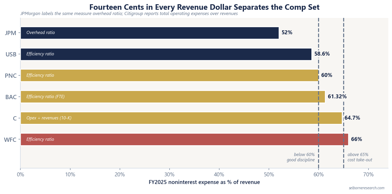
US Bancorp at 58.6% is the super-regional proof point: regional scale with money-centre-like 18.1% ROTCE and a cost base below the 60% line. Wells Fargo at 66% still carries the widest gap among money-centre names in the comp set, consistent with its post-scandal normalisation arc.
Why Overhead Ratio Is Not Just Accounting
Efficiency ratio captures branch networks, technology spend, compliance, and corporate layers. It does not capture credit quality directly, but high overhead leaves less room to absorb net charge-offs before ROTCE falls.
One caution before you read a falling ratio as cost control. Revenue is the denominator, so the ratio improves when revenue rises even if not a single cost has been taken out. A rate cycle that widens NIM flatters every bank’s efficiency ratio at once, and a bad trading quarter worsens them without anyone hiring. Business mix does the same thing structurally: an investment bank pays out a large share of revenue in compensation, so a heavy markets or advisory business runs a higher ratio than a deposit franchise on the same quality of management. Compare a bank to its own history and to banks doing the same thing.
Pair cost data with spread and valuation:
- NIM / net yield tells you what the balance sheet earns. See Net interest margin explained.
- P/TBV vs ROTCE tells you what the market pays for the returns that remain after costs and credit. See P/TBV vs ROTCE.
JPMorgan runs 2.50% consolidated net yield and 52% overhead, producing 20% ROTCE and ~2.89× P/TBV (Jun 2026). Wells Fargo runs 2.64% NIM but 66% efficiency, producing 14.6% ROTCE and ~1.84× P/TBV. Spread alone does not explain the valuation gap.
Worked Example: 14 pp Overhead Gap
Compare JPMorgan (52%) and Wells Fargo (66%) on filed FY2025 ratios. Assume both banks report $100bn of total revenue (net interest income plus noninterest income) for illustration:
| Bank | Efficiency ratio | Noninterest expense | Pre-provision revenue after overhead |
|---|---|---|---|
| JPMorgan | 52% | $52bn | $48bn |
| Wells Fargo | 66% | $66bn | $34bn |
Wells Fargo spends $14bn more on noninterest expense per $100bn of revenue, leaving $14bn less before loan-loss provision and tax. That is the mechanical link between a 14 pp efficiency gap and lower ROTCE, before credit cycle effects.
The example uses hypothetical revenue dollars for clarity; the 52% and 66% ratios are from filed FY2025 disclosures.
Citigroup and Bank of America: Middle of the Pack
Bank of America at 61.32% on the taxable-equivalent basis it reports sits just above the 60% threshold. Citigroup at 64.7% (10-K definition: total operating expenses divided by total revenues, net) rounds to 65% in presentations. Both are average-band names: neither the cost leader nor the clearest take-out story in the comp set.
Citigroup’s restructuring plan targets efficiency improvement; until ratios move, the market prices sub-par 7.7% ROTCE alongside 64.7% costs.
Using the Screen
When screening large banks:
- Pull efficiency ratio (or overhead ratio) from the earnings supplement.
- Compare to the 60% screening line and the comp ladder above.
- Ask whether a high ratio is cyclical (investment year) or structural (branch overlap, legacy systems).
- Cross-check ROTCE: a bank can run a mediocre efficiency ratio if NIM and credit are exceptional, but that is rare at scale.
For profiles on the cost leader, the super-regional benchmark, and the take-out name, see JPMorgan Chase, US Bancorp, and Wells Fargo.
What Matters Most
Efficiency ratio is a single line with a clear direction: lower is better. The FY2025 spread from JPMorgan at 52% to Wells Fargo at 66% is not noise; it is billions of dollars of revenue consumed by overhead before shareholders see returns. Read the label (overhead vs efficiency), compare within the comp set, and tie the result to ROTCE.
A 14-point overhead gap is where this guide stops. The primer prices each of those points into intrinsic value per share.
The Excel model is the primer's three residual-income builds live across 12 sheets: change the margin, the credit charge or the cost of equity and the valuation moves.
Frequently Asked Questions
- What is the bank efficiency ratio?
- The efficiency ratio is noninterest expense (less amortisation of intangibles) divided by net interest income plus noninterest income. Lower is better: fewer cents of overhead per dollar of revenue. The FDIC and FFIEC use this definition in quarterly banking profile data.
- What is a good efficiency ratio for a bank?
- House screen: below 60% indicates good cost discipline. Between 60% and 65% is average for a large bank; above 65% flags a cost take-out story. Verified FY2025: JPMorgan 52%, US Bancorp 58.6%, PNC 60%, Bank of America 61.32% (FTE), Citigroup 64.7%, Wells Fargo 66%.
- Why does JPMorgan call it overhead ratio?
- JPMorgan labels the same concept overhead ratio in its MD&A rather than efficiency ratio. The numerator is noninterest expense; the denominator is total net revenue. Compare JPMorgan's 52% overhead ratio to peers' efficiency ratios with the label difference in mind; the economic question is the same.
- How does efficiency ratio affect bank valuation?
- Two banks with similar NIM and credit costs can report different ROTCE if overhead differs. A 14 percentage-point gap in efficiency ratio (JPMorgan 52% vs Wells Fargo 66%) means Wells Fargo spends 14 cents more per dollar of revenue on noninterest expense before credit losses. Markets price that through lower sustainable ROTCE and P/TBV.