Copper Cost Curve: C1 Cash Costs of the Majors
The copper C1 cost curve by quartile, anchored on Southern Copper, BHP Escondida and Teck QB, why by-product credits reorder it, and C1 versus all-in cost.
Educational analysis for professional use. This guide is not investment advice or a recommendation to buy or sell any security, and it is not personalised.
The Copper Cost Curve Has Two Numbers, Not One
Like iron ore, copper is a cost-curve business: producers sell essentially the same metal into the same market at the same exchange price, so position on the cost curve, not any product moat, separates a strong copper equity from a weak one. Unlike iron ore, copper mines pour valuable by-products, gold, molybdenum, silver, zinc, and the revenue from those swings the reported cost enormously. That is why a copper cost curve has two numbers for most producers, a cost before by-product credits and a cost after, and why reading one as the other is the commonest mistake in the sector.
A by-product-rich mine is the clean illustration. It can report a gross cash cost above 200 cents a pound and a net C1 near 60 cents, a figure nearly four times larger or smaller depending only on which line you quote. Neither is wrong; they answer different questions. The gross figure is what it costs to mine the copper; the net figure is the producer’s competitive position once its gold and moly are sold. A curve that mixes the two across producers is meaningless.
So the C1 curve is the first table in any copper model, and the by-product footnote is where the analysis actually lives.
The Shape of the Copper C1 Curve
The durable way to hold the curve is by quartile position rather than by this year’s exact figures, which move with metal prices every reporting season. On the net-of-by-product basis, the majors’ disclosed FY2025 C1 spreads across a wide band, and where a mine sits is set as much by its by-product deck as by its geology.
| Curve position | Net C1 (¢/lb, FY2025) | What sits here |
|---|---|---|
| Low-cost (bottom quartile) | below ~90 | Mines with large gold, moly or silver credits netted off |
| Mid-curve | ~100-170 | Solid producers with moderate credits |
| High-cost (top quartile) | above ~210 | Single-metal or higher-strip mines, and near-pure-copper mines whose figure is effectively gross |
Three producers anchor the curve, each checked against its own FY2025 filing:
| Producer | Net C1 (¢/lb, FY2025) | Basis / note |
|---|---|---|
| Southern Copper | 58 | Net of gold, moly and silver credits; 217 before credits, nearly four times the net |
| BHP (Escondida) | 119 | Asset stand-in for the group; BHP labels copper “unit cost”, not C1 |
| Teck (QB) | 267 | Flagship asset, not a company-wide figure; “net cash unit cost” |
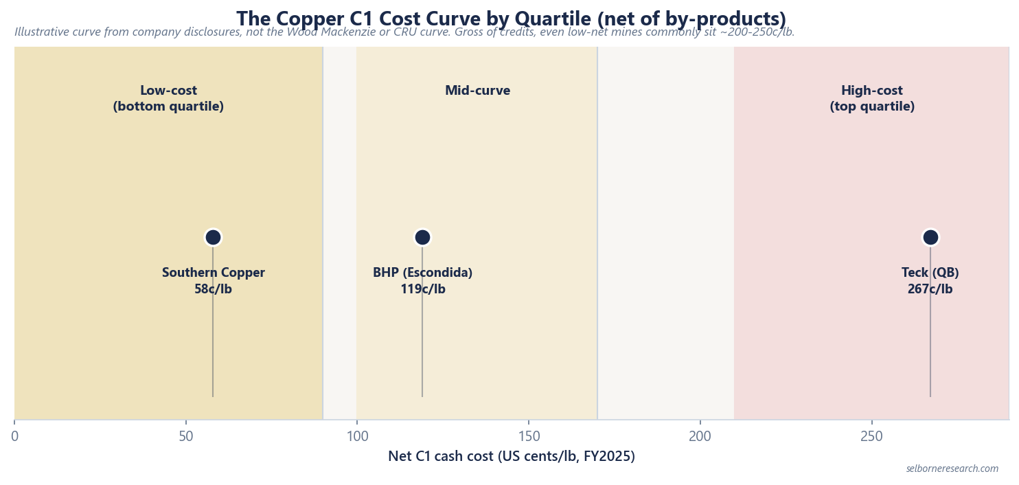
This is an illustrative curve, built from each producer’s own disclosed C1, not the proprietary global copper cost curve that Wood Mackenzie or CRU sell. The three named points are the FY2025 figures we have checked against the companies’ filings; the rest of the field sits in position bands rather than named dots, because a curve assembled from mixed reporting bases is only as trustworthy as the footnote on each figure. Glencore is left off entirely: it publishes no per-pound copper cash cost in its FY2025 results.
Three things reorder the curve, and each is a trap in a broker table that flattens them into one column:
- Net versus gross by-product basis is the big one. Southern Copper sits at the bottom on 58c/lb net, but its gross mining cost is 217c/lb, above most of the field. Where a producer’s by-products are rich, the net figure tells you its competitive position; the gross figure tells you what the rock costs to mine. Rank on one basis, consistently, and say which.
- Company versus asset level. BHP publishes no group copper C1, so Escondida stands in for it; Teck’s headline is its QB flagship rather than a company-wide number. Only some published figures are truly “the company”.
- Not every figure is net, and not every label is “C1”. A near-pure-copper mine like Ivanhoe’s Kamoa-Kakula has little to credit, so the cost it reports is effectively gross and does not sit on the same footing as the netted figures above it. And some majors call the metric “unit cost” rather than C1, reserving “C1” for their iron ore. Match the metric, not the word, and check the basis before you rank.
The discipline is the one gold analysts apply to AISC versus cash cost: the headline number is a starting point, and the note telling you what it includes is the comparison. A cross-miner copper cost table without a basis column is a table you cannot trust.
By-Products Are the Curve’s Real Axis
In iron ore the cost curve is mostly about geology and haulage. In copper it is at least as much about the by-product deck, and that deck moves with metal prices you do not control. When the gold price rises, a copper mine with a gold credit reports a falling net C1 without changing a thing underground. A major’s net copper C1 can halve in a single year on a higher gold price alone, with the fall attributed to richer gold by-product credits rather than to any operating gain underground.
That has two consequences for how you use the curve. First, a net-C1 improvement is not automatically an operating improvement; check whether the mine got better or the by-product price did. Second, a producer’s position on the net curve is only as stable as its by-product prices, so a mine that looks bottom-quartile on today’s gold price can drift up the curve if gold falls. Gross C1 is the more stable measure of the mining operation itself; net C1 is the more relevant measure of cash generation at today’s prices. You need both columns for the same reason you need a decline curve and a reserve statement: each answers a question the other cannot.
From C1 to the All-In Cost
C1, on either basis, is well under the full cost of a pound of copper. The all-in cost adds sustaining capital, government royalties (material in Chile and rising in several jurisdictions), and corporate overhead. That gap is what a long-term copper price has to clear, and it is why a low net C1 does not by itself mean a mine is free-cash-generative at that level. The same point applies to gold through AISC: the sustaining-capital line is exactly what a bare cash cost leaves out, and it is rarely small at a large open-pit copper mine.
So build the curve in layers: gross C1 for the mining operation, net C1 for cash-cost position at current by-product prices, and an assembled all-in cost for the breakeven test. Rank producers on the layer that answers your question, and never test a copper price against C1 when you mean all-in.
What the Curve Clears at Planning Prices
Our copper planning price is $11,000/t, about $4.99/lb (worked examples use demonstration prices; check the current copper price when modelling). Against that mark the whole net-C1 curve, from Southern Copper’s 58c/lb at the bottom to Teck’s QB at 267c/lb near the top, sits far below the price, so every major on it is cash-generative on a C1 basis even at a deliberately conservative copper price. That is the through-cycle resilience low-curve position buys, and it is why copper equities are analysed on reserve-based NAV against a long-term price rather than on a spot-price snapshot.
The caution the planning-price comfort hides is the all-in layer. A net C1 of 250c/lb with heavy sustaining capital and a rising royalty can carry an all-in cost two or more times its C1, and that is the number a $4.99/lb price actually has to beat. The curve tells you who mines cheaply; the all-in cost tells you who survives a low price. Keep them separate.
Reading a Copper Cost Curve Without Being Misled
When a broker table ranks copper producers on a single C1 column, check three things before you trust the ranking. Is every figure on the same by-product basis, net or gross? Are the rows companies or single assets standing in for them? And do the periods line up, given that producers’ fiscal years differ? If those three have been flattened into one tidy column, the ranking is noise dressed as analysis.
A copper cost curve is busier than an iron ore one, because the by-product deck does so much of the work. That is not a reason to avoid it; it is the reason it rewards the analyst who reads the footnotes. Build the curve on a consistent basis, keep the gross and net columns side by side, and rank on price-minus-all-in when you want the margin story rather than the cost-curve story.
A net C1 is a cost-curve position, not a breakeven. The primer builds the whole cost stack into a copper mine NAV.
The Excel model is the primer's two NAVs live across 12 sheets: change the gold price, ramp or discount rate and the valuation moves.
Frequently Asked Questions
- What is C1 cash cost in copper mining?
- C1 cash cost is the direct cost of producing a payable pound of copper: mining, processing, on-site administration, and the treatment and refining charges to turn concentrate into metal. It excludes sustaining capital, royalties and corporate overhead. Most copper miners report C1 net of by-product credits, the revenue from gold, molybdenum, silver, zinc or cobalt produced alongside the copper, which is subtracted from the cost. A few report before credits. The two bases are not comparable, so the footnote saying which one you are reading matters more than the number.
- Why do copper C1 costs vary so much between miners?
- By-product credits. A copper mine that also pours gold and molybdenum can report a net C1 a fraction of its gross mining cost, because the by-product revenue is netted off. Southern Copper reported an operating cash cost of $2.17/lb before by-product credits for 2025 but about $0.58/lb net of them, roughly a quarter of the gross figure. Two mines with near-identical mining costs can therefore sit far apart on a net-C1 curve purely on how rich their by-products are and where gold and moly prices happen to be. It makes copper cost curves more treacherous to compare than iron ore, where by-products barely feature.
- What is the difference between C1 and all-in cost in copper?
- C1 covers direct cash production costs only. The all-in cost adds sustaining capital expenditure, government royalties and corporate overhead, and it is the number a long-term copper price has to clear, not C1. A miner quoting a low net C1 is not necessarily generating free cash at that level once sustaining capital and royalties are added back. Treat C1 as cost-curve position, and the all-in cost as the breakeven test.